ellipsis multiple lines text doesn't work (i.e. add support for -webkit-line-clamp)
Categories
(Core :: CSS Parsing and Computation, enhancement)
Tracking
()
People
(Reporter: sjochimek, Assigned: heycam)
References
(Depends on 3 open bugs, Blocks 1 open bug, )
Details
(Keywords: dev-doc-complete, perf:responsiveness, Whiteboard: [webcompat:p1], platform-rel-Facebook, [geckoview:p2] [layout:backlog:2019q2:68]][wpt-failing][wpt-new-tests][wptsync upstream])
User Story
Business driver: Facebook Performance. Workaround for this bug is slower on Firefox. [selena] facebook is planning to enable this soon, and frmr Mozillians gave us the heads up. Also, multiple top and long tail site compat.

Note: bz suspects safety here.
Attachments
(9 files, 2 obsolete files)
 Article-title.png
We should be able to ellipsis a paragraph and defined the content of the ellipsis.

For now ellipsis only take care of one line text.
In Webkit/Blink this is available with line-clamp css

p {
  display: -webkit-box;
  -webkit-line-clamp: 3;
  -webkit-box-orient: vertical;
  text-overflow: ellipsis;
}

With an informative article on Chris Coyier's blog

https://css-tricks.com/line-clampin/
|
||
Comment 2•8 years ago
|
||
As a Web app developer, I'd like to see this in Firefox.
|
|
||
Updated•8 years ago
|
I don't think so. This is very Hack.We should implement the max-lines property in bug 1232992.
|
|
||
Comment 4•8 years ago
|
||
This could eventually be an alias of the max-lines property.
|
||
Updated•8 years ago
|
This hack works for me:

@-moz-document url-prefix() {
    overflow: hidden;
    position: relative;
    &:before {
      background: #fff;
      bottom: 0;
      position: absolute;
      right: 0;
      float: right;
      content: '\2026';
      margin-left: em(-36);
      width: em(60);
      padding-left: em(5);
    }
    &:after {
      content: '';
      background: #fff;
      position: absolute;
      height: em(50);
      width: $width100;
      z-index: 1;
    }
}This hack works for me:
@-moz-document url-prefix() {
overflow: hidden;
position: relative;
&:before {
background: #fff;
bottom: 0;
position: absolute;
right: 0;
float: right;
content: '\2026';
margin-left: em(-36);
width: em(60);
padding-left: em(5);
}
&:after {
content: '';
background: #fff;
position: absolute;
height: em(50);
width: 100%;
z-index: 1;
}
}
|
||
Comment 7•7 years ago
|
||
Add another example to use -webkit-line-clamp
|
||
Updated•7 years ago
|
|
||
Updated•7 years ago
|
|
|
||
Updated•7 years ago
|
|
||
Updated•7 years ago
|
|
|
||
Updated•7 years ago
|
|
|
||
Updated•7 years ago
|
|
|
||
Updated•7 years ago
|
|
|
||
Comment 8•7 years ago
|
||
Google search Entertainment - movie section for Gecko with a Chrome UA to get tier1.
https://webcompat.com/issues/7347
|
|
||
Updated•7 years ago
|
|
|
||
Updated•7 years ago
|
|
|
||
Updated•7 years ago
|
|
|
||
Updated•7 years ago
|
|
|
||
Updated•7 years ago
|
|
|
||
Updated•7 years ago
|
| Comment hidden (advocacy) |
|
|
||
Updated•6 years ago
|
|
|
||
Updated•6 years ago
|
https://twitter.com/cssrossen/status/969433795614027776 says -webkit-line-clamp is now implemented in a forthcoming Edge preview.
|
||
Comment 11•6 years ago
|
||
Facebook currently is flushing style+layout to implement this behavior manually causing a non trivial performance hit. In Chrome we will begin to use CSS line-clamp to remove this performance hit. We will continue to support the alternate code path for Firefox users but it would be great to have a fast solution for Firefox users. This is for shared newsfeed article titles and description. ni? me if you need more information.

I should also note that the correctness is difficult to get right as well. We can't measure and wrap the text until we mount and make the elements visible in the DOM but we have unrelated code that is hiding and unmounting news feed items for performance reason. This code must be made aware of each other while limiting the flushes. With a CSS solution this isn't a problem because it's handled by the browser.
|
||
Updated•6 years ago
|
|
||
Comment 12•6 years ago
|
||
Fantasai and I wrote a new tentative spec for this. Please don't jump into implementing / shipping it as is just yet, as it is a first draft, but it is meant to solve this problem, so if you're looking into this, feedback is very much welcome.

A good place to start reading about it is this introductory comment:
https://github.com/w3c/csswg-drafts/issues/390#issuecomment-371076389

The spec itself is over there:
https://drafts.csswg.org/css-overflow-3/#line-clamp

That the design does depend on max-lines, so closing this would also close https://bugzilla.mozilla.org/show_bug.cgi?id=1232992
|
||
Comment 13•6 years ago
|
||
Benoit, thanks for the heads-up.  Can you tell us more about how you will
use this property exactly? (example of typical content)  I'm wondering
if counting top-level lines, not lines in nested blocks, would be sufficient.
Are you using a display:-webkit-box box together with overflow:hidden?

> In Chrome we will begin to use CSS line-clamp

Nit: I wouldn't call the proprietary -webkit-line-clamp property
"CSS line-clamp", because it's very much non-standard.
I have to say I'm a bit surprised Facebook has decided to go down
this "best viewed in Chrome" route...|
|
||
Comment 14•6 years ago
|
||
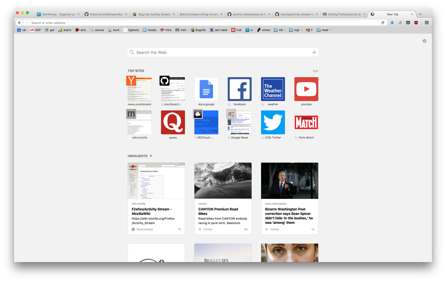
Actually Firefox itself does need this, particularly for the Highlights section on Activity Stream where the page titles and descriptions are chopped for now.

https://wiki.mozilla.org/images/e/ec/ActivityStream.png

In this screenshot, there should be an ellipsis after the word "Maximum" on the middle column.
|
|
||
Comment 15•6 years ago
|
||
(It's Bug 1417163 which already depends on this bug)
|
|
||
Comment 16•6 years ago
|
||
I want to emphasize that we are not looking specifically for -webkit-line-clamp. From my research it does appear to have some design limitations [1] but it's not an area that I know well so I'll leave it to the standards committee to evaluate it. We're happy to use whatever is implemented that solves the use case.

(In reply to Mats Palmgren (:mats) from comment #13)
> Benoit, thanks for the heads-up.  Can you tell us more about how you will
> use this property exactly? (example of typical content)  I'm wondering
> if counting top-level lines, not lines in nested blocks, would be sufficient.

We're looking to use this for the wrapping of article titles and descriptions. I can attach a screenshot. But taking a look at our source, this property is already used 100s of times on the Facebook site. I can't really say if there's a suitable workaround since this isn't my area of expertise but I'm happy to pass it along to the appropriate product team if we think this property isn't actually needed.

> Are you using a display:-webkit-box box together with overflow:hidden?

The majority of the time, yes.

> I have to say I'm a bit surprised Facebook has decided to go down
> this "best viewed in Chrome" route...

I don't think this is an accurate characterization of the situation.

[1] https://medium.com/mofed/css-line-clamp-the-good-the-bad-and-the-straight-up-broken-865413f16e5
|
|
||
Comment 17•6 years ago
|
||
|
|
||
Comment 18•6 years ago
|
||
Here's the link to the article to reproduce: http://www.scarymommy.com/st-john-ambulance-makes-infant-cpr-video/

Right now this is still using JS to fix up so it's not a good practical example itself but at least can serve as an illustration.
|
||
Comment 19•6 years ago
|
||
In the example you're showing, the ellipsis is not placed near the end of the line: more words would fit on that last line, in addition to the ellipsis. How are you deciding where to put the ellipsis? Also if you want the ellipsis mid-word, that conflicts with the desire in https://medium.com/mofed/css-line-clamp-the-good-the-bad-and-the-straight-up-broken-865413f16e5 to not put an ellipsis mid-word... :/
|
|
||
Comment 20•6 years ago
|
||
Yes it's a pretty terrible example and not the desired outcome. I think we would prefer to fill the line and not put the ellipsis mid-word if possible. I've asked for a better example. I'll post next week with one.
|
|
||
Comment 21•6 years ago
|
||
Here's a codepen with our use case https://codepen.io/anon/pen/KoyPzM using -webkit-line-clamp that simulates our article title use case, I don't believe it's live on the site but rather we're still using JavaScript everywhere for the time being. I did confirm that it would be best to avoid ellipsis mid-word unlike Chrome's implementation.
|
|
||
Comment 22•6 years ago
|
||
That seems compatible with the proposed spec, so good to hear. :)
|
|
||
Updated•6 years ago
|
|
|
||
Updated•6 years ago
|
|
||
Updated•6 years ago
|
|
|
||
Updated•6 years ago
|
|
||
Updated•6 years ago
|
|
|
||
Updated•6 years ago
|
|
||
Comment 23•6 years ago
|
||
(Note: If & when we implement the unprefixed "line-clamp" proposed spec text, it's unclear whether it'd be wise to also ship unprefixed "-webkit-line-clamp" as an alias for it.

As I understand it, Safari & Chrome's -webkit-line-clamp feature is strictly limited to things with "display: -webkit-box", and has no effect on anything else. Whereas, the modern version has effects on *all* content.  So: if we were to implement the modern spec and naively ship a webkit-prefixed alias of the modern thing, then it's possible we'd break content, by virtue of honoring styles on elements with "-webkit-line-clamp:3;display:block" that are inactive in Chrome/Safari.

We could try to implement a "smart" not-quite-alias that checks the display value at layout-time before taking effect, or something like that, but that sounds pretty painful... so in an ideal world, I'd hope we could implement & ship the modern thing without any alias, and then encourage sites that care about this to use the modern thing.
|
|
||
Comment 24•6 years ago
|
||
Indeed, and their implementation of -webkit-line-clamp for
display:-webkit-box doesn't match what the spec says either.
|
|
||
Comment 25•6 years ago
|
||
I could re-check to see how -webkit-line-clamp is used on most sites (in the seeAlso) and see if we have a really defined pattern for the layout or if there is a variety of cases.
|
|
||
Comment 26•6 years ago
|
||
(In reply to Karl Dubost :karlcow from comment #25)
> I could re-check to see how -webkit-line-clamp is used on most sites (in the
> seeAlso) and see if we have a really defined pattern for the layout or if
> there is a variety of cases.

That would be good, thanks Karl.
|
||
Comment 27•6 years ago
|
||
This was marked as Q3 work in layout triage. I think we should probably aim to get it done for Firefox 64 given the impact on facebook. I think it's on the list of things to discuss at CSSWG.
|
Assignee | |
Comment 28•6 years ago
|
||
I'm going to pick this one up (in a couple of weeks).

After some discussion this week I don't think we want to implement the -webkit-line-clamp alias itself, as there is too much risk of incompatibility with Blink and WebKit's implementation oddities.  So I think we should implement the standards version (the max-lines and block-overflow longhands and the line-clamp shorthand) and then get feedback from Benoit.
|
|
Assignee | |
Comment 29•6 years ago
|
||
Once we have an implementation of the standards version we can look at whether we really need to implement the oddities of -webkit-line-clamp.

The most important oddity is probably that it only applies with display:-webkit-box;-webkit-box-orient:vertical; as dholbert mentioned earlier.  Secondary oddities are that the overflowed lines still get rendered, but that's less likely to be a compat issue since authors need to put a max-height / overflow:hidden on the element to hide them away anyway.
|
|
||
Comment 30•6 years ago
|
||
Happy to provide feedback and make sure that Firefox users on Facebook are getting the standard CSS property and no longer have to run the slow JS fallback. \o/
|
|
||
Comment 31•6 years ago
|
||
# Documenting -webkit-line-clamp

How:
====

* limiting the number of lines shown
* limiting the number of lines shown AND add an ellipsis

Contexts:
=========

* Most of them are used in search lists (shop, search engines, appointments list) where items need to be compact and boxes regular.
* Most of them are -webkit-line-clamp for 2 or 3 lines. Majority: 2, Marginally: 1.
* High profile sites is using it
* frequent in mobile layouts where the real estate constraints are more important.


Dependencies (on WebKit and Blink):
===================================
This creates an ellipsis at the end of the 2nd line.
.blah { display: -webkit-box;
       -webkit-box-orient: vertical;
       overflow: hidden;
       -webkit-line-clamp: 2;}

This just hides the line without ellipsis after the 2nd line.
.blah { display: flex;
       flex-direction: vertical;
       overflow: hidden;
       -webkit-line-clamp: 2;}

adding text-overflow: ellipsis doesn't change anything.


Identified issues (on Gecko):
=============================

* text overlapping the next box making it unreadable.
* box being bigger for containing the text pushes the layout and breaks it (such as 2 columns of square boxes not the same height anymore, or boxes not cascading properly giving a stair effects)
* in 2 lines case, the 3rd line being cut partially from the bottom (sometimes being unreadable)
* height of box creates an unwanted scrollbar


List of sites:
==============

## Linkedin (fixed by the site)
https://webcompat.com/issues/1860
text overflowing on the next box, making it unreadable.
https://codepen.io/webcompat/pen/ERdPbV

## m.mafengwo.cn
https://webcompat.com/issues/4772
text overflowing on the next box, making it unreadable.

```css
.guideflow .bd dd .summary {
    display: -webkit-box;
    -webkit-line-clamp: 3;
    -webkit-box-orient: vertical;
    overflow: hidden;
    text-overflow: ellipsis;
}
```


## disney.com
https://webcompat.com/issues/5605
text making a higher box and then destroying the layout of square boxes side by side.

```css
h2.longText {
    overflow: hidden;
    display: -webkit-box;
    -webkit-line-clamp: 2;
    -webkit-box-orient: vertical;
}
```

## fr.finance.yahoo.com
https://webcompat.com/issues/6403
Pushing the next box of layout below and then destroying the layout.

```css
._3_iaU a, ._3_iaU p {
    display: -webkit-box;
    -webkit-line-clamp: 2;
    -webkit-box-orient: vertical;
    overflow: hidden;}
```

## www.ebay.fr
https://webcompat.com/issues/6479
text overlapping the next box.

```css
.ebayui-ellipsis-2 {
    display: -webkit-box;
    overflow: hidden;
    text-overflow: ellipsis;
    -webkit-line-clamp: 2;
    -webkit-box-orient: vertical;
}
```

## www.dailymotion.com
https://webcompat.com/issues/6730

text too long gets some characters like y, g, p cut in the bottom.


```css
.collection-item-title {
    font-size: 15px;
    line-height: 17px;
    margin: 0;
    font-weight: 600;
    color: #404040;
    overflow: hidden;
    display: -webkit-box;
    -webkit-line-clamp: 2;
}
```


## google.com
https://webcompat.com/issues/7347

pushing the text below and making it disappear.
```css
._Wqo {
    -webkit-box-orient: vertical;
    color: rgba(0,0,0,.87);
    display: -webkit-box;
    font-size: 14px;
    -webkit-line-clamp: 2;
    line-height: 20px;
    overflow: hidden;
    text-overflow: ellipsis;
    white-space: initial;
}
```


## www.ndtv.com
https://webcompat.com/issues/7468

text cut in the middle because the height is fixed.

```css
.h__truncate, .h__txt-truncate {
    overflow: hidden;
    text-overflow: ellipsis;
}

.h__truncate {
    display: -webkit-box;
    position: relative;
    -webkit-line-clamp: 2;
    -webkit-box-orient: vertical;
}
.media-list__title {
    height: 32px;
    line-height: 1.2;
    font-size: 1.4rem;
}

.media-list--news .media-list__title {
    max-height: 50px;
    -webkit-line-clamp: 3;
}
```

## www.rediff.com
https://webcompat.com/issues/7482

text overlapping the next box.

```css
.ftitle span {
    text-decoration: none;
    color: #212121;
    text-shadow: 0 1px 0 #F3F3F3;
    font-size: 14px;
    overflow: hidden;
    display: -webkit-box;
    -webkit-line-clamp: 2;
    -webkit-box-orient: vertical;
    text-overflow: ellipsis;
    line-height: 1.2;
    position: relative;
}
```

## www.baidu.com
https://webcompat.com/issues/8290

text overlapping the next box.

## www.justdial.com
https://webcompat.com/issues/7647

text overlapping the next box.

## istyle.ltn.com.tw
https://webcompat.com/issues/9404

Characters cut halfway.

```css
lbox h5 div {
    padding: 3px 8px 0px;
    overflow: hidden;
    text-overflow: ellipsis;
    display: -webkit-box;
    -webkit-line-clamp: 2;
    -webkit-box-orient: vertical;
    line-height: 1.7rem;
    font-size: 1.2rem;

}

```

## m.youtube.com
https://webcompat.com/issues/13805

pushing the layout below and hidding part of the text.
```css
.gpb.qkb .np {
    overflow: hidden;
    display: -webkit-box;
    -webkit-line-clamp: 2;
    -webkit-box-orient: vertical;
    text-overflow: ellipsis;
}
```

## www.zdfans.com
https://webcompat.com/issues/15477

boxes being too high they don't float correctly and cascade. Layout destroyed.

```css
#content .entry-inner h2.post-title {
    overflow: hidden;
    -o-text-overflow: ellipsis;
    -ms-text-overflow: ellipsis;
    text-overflow: ellipsis;
    -webkit-box-orient: vertical;
    -moz-box-orient: vertical;
    -ms-box-orient: vertical;
    box-orient: vertical;
    display: -webkit-box;
    -webkit-line-clamp: 2;
    padding-right: 0%;
    line-height: 115%;
    font-size: 110%;
    margin: 3px 0 0;
    height: 2.3em;
}
```

## mail.google.com
https://webcompat.com/issues/16734

Creating a scrollbar into a box because the layout is too high.

```css
.xQ6AJ {
    font-family: 'Google Sans',Arial,sans-serif;
    font-size: 1rem;
    font-weight: 500;
    letter-spacing: .01rem;
    line-height: 1.375rem;
    overflow-wrap: break-word;
    word-wrap: break-word;
    font-size: 1.25rem;
    display: -webkit-box;
    overflow: hidden;
    -webkit-line-clamp: 2;
    -webkit-box-orient: vertical;
}
```
|
||
Updated•6 years ago
|
|
|
||
Updated•6 years ago
|
|
|
||
Comment 32•6 years ago
|
||
This testcase tests "-webkit-line-clamp: 3". In Chrome 68, an ellipses is inserted after "4" in the first two boxes and there's no ellipses in the third box.
|
|
||
Updated•6 years ago
|
|
|
||
Comment 33•6 years ago
|
||
In Bug 1479563, I’m adding `-webkit-line-clamp` to *this* Bugzilla’s Requests dropdown list. A screenshot can be found in my PR: https://github.com/mozilla-bteam/bmo/pull/682
|
|
||
Comment 34•6 years ago
|
||
We got feedback that Twitter needs this too.
|
||
Updated•6 years ago
|
|
||
Updated•6 years ago
|
|
||
Comment 35•5 years ago
|
||
Is there is a pure CSS solution supported by FF, actually or in preparation, instead of the fallback in JS ?
|
|
||
Updated•5 years ago
|
|
|
||
Updated•5 years ago
|
|
|
||
Updated•5 years ago
|
|
|
||
Updated•5 years ago
|
|
||
Updated•5 years ago
|
|
|
||
Comment 36•5 years ago
|
||
Another issue with tokopedia
https://twitter.com/ReinPre10/status/1090646030134079488
|
|
Assignee | |
Updated•5 years ago
|
|
|
Assignee | |
Comment 37•5 years ago
|
||
Reflecting a couple of off-bug mails back here:
Cameron McCormack wrote:
I think initially I just want to implement line-clamp with the syntax
none | <integer>
and leave the implementation of the component longhands (max-lines, continue, and block-ellipsis) until later. I.e. we only support the effect of { max-lines: none; continue: auto; block-ellipsis: none; } or { max-lines: <n>; continue: discard; block-ellipsis: none; }.
As far as I can tell, the interesting requirements here are:
max-lines applies to a block element, and counts all descendant lines except for those under any independent formatting contexts (like BFCs).
The lines in excess of max-lines are fragmented away into the ether as if they were display:none.
The excess lines do contribute to the inline min-content and max-content size of the elements, but do not contribute to the block component of those sizes.
The fact that we need to consider the excess lines for sizing makes it sound like we need to be creating lines and frames for their content. But where should we be putting them? I see there is an OverflowLines property that holds lines during reflow, so could it make sense to leave them there, or in some other list? Or should I be thinking about a more general mechanism for holding fragmented-away content?
|
|
Assignee | |
Comment 38•5 years ago
|
||
Mats Palmgren:
Cameron McCormack:
I think initially I just want to implement line-clamp with the syntax
none | <integer>
and leave the implementation of the component longhands (max-lines, continue, and block-ellipsis) until later.
OK, sounds good, that's what ISSUE 10 in the spec recommends (i.e. not exposing the longhands for now).
But perhaps we should consider shipping it as -webkit-line-clamp (not an alias), and only support it on display:-webkit-box boxes? I'm a little concerned that the CSS spec isn't compatible with what's implemented in Chrome, and to expose the -webkit- property on other types of boxes (that currently does nothing in Chrome). More on the incompatibilities below...
As far as I can tell, the interesting requirements here are:
- max-lines applies to a block element, and counts all descendant lines except for those under any independent formatting contexts (like BFCs).
I think that's what the current spec says, yes. I seem to recall it was a lot more advanced in an earlier version though, and it's not clear to me whether the current spec reflects what authors actually want. (I'm a bit skeptical about that.) It might just be that it was edited to better match Chrome's broken implementation. https://github.com/w3c/csswg-drafts/issues/2847#issuecomment-401412504
The requirement to not count lines in child BFCs seems a bit too strict to me. As the spec notes, it means it can't be used on column containers for example, which seems a bit sad. It seems reasonable that scroll containers are excluded though, but do they count as a line? e.g.
<div>a<div style="overflow:scroll">...</div>b</div>To me, that seems like three lines, but if I read the spec correctly it only counts as two towards max-lines.
(Fwiw, I don't see anything in principle that would prevent us from counting rows in grid/flex/tables as "lines" for this property. They all support fragmentation. But perhaps that's something that could be added later on if authors asks for it.)
The lines in excess of max-lines are fragmented away into the ether as if they were display:none.
That's not how -webkit-line-clamp works in Chrome. If the clamped box has overflow:visible then it simply overflows. (see the testcase in my github comment above). The spec says that line-clamp:<integer> implies continue:discard (which would treat them as display:none), but that's incompatible with -webkit-line-clamp (where you'd use overflow:hidden to do the "discarding"). Maybe we should ask for a spec change here (making continue:auto the default). Otherwise, I don't think -webkit-line-clamp can ever be an alias.
continue:auto seems a lot simpler to implement - just flow the block as usual and then set the bsize in ComputeFinalSize to the extent of the Nth line. Perhaps also adjust the reflow status accordingly. The ellipsing can probably be done by reflowing the Nth line again with some children pushed to make room for it. I don't think we need any special child list stuff or continuations for this. (Note that if the block itself also has overflow:hidden then we can probably skip flowing lines after the Nth line, which I think is the optimization Facebook is looking for.)
continue:discard is harder. For this we should probably stop flowing more lines and push the remaining children onto a DiscardedChildrenList or something, and simply not render them. I think the boxes must exist though, and our pull-up code needs to look for them. Alternatively, we could add them to ExcessOverflowContainersList and mark them as "discarded" with a frame bit. And then teach the code dealing with those lists ([Excess]OverflowContainersList) to ignore them.
I think that we need to deal with overflow from a line that is included, e.g.
<div style="max-lines:1; continue:discard">
   <img style="height:1000px"><br>b
Here, "b" should be discarded but the <img> will have overflow that should be rendered (I think). So, we'd have both normal overflow containers and "discarded" ones there in this case.
I think ExcessOverflowContainersList might be less work than adding a new child list.
The excess lines do contribute to the inline min-content and max-content size of the elements, but do not contribute to the block component of those sizes.
Yeah, that makes sense to me.
But where should we be putting them? I see there is an OverflowLines property that holds lines during reflow, so could it make sense to leave them there, or in some other list?
I think OverflowLines is for when the block itself is incomplete, which I don't think is the case here.
|
|
Assignee | |
Comment 39•5 years ago
|
||
Mats Palmgren:
The ellipsing can probably be done by reflowing the Nth line again with some children pushed to make room for it.
Actually, that's not what -webkit-line-clamp does in Chrome, e.g.:
<style>
.clamp { -webkit-line-clamp: 3; }

.box {
   display: -webkit-box;
   -webkit-box-orient: vertical;
   width: 100px;
   border: 1px solid;
}
</style>

<div style="display:inline-block; border: dotted">
<div class="box clamp" style="height:6em">
   1<br>
   2<br>
   333333333333333333333333333333333<br>
   4<br>
   5<br>
   6<br>
   7<br>
   8<br>
</div>
</div>
So, we can probably reuse our 'text-overflow' code for that.
|
|
Assignee | |
Comment 40•5 years ago
|
||
(In reply to Cameron McCormack (:heycam) from comment #38)
Mats Palmgren:
But perhaps we should consider shipping it as -webkit-line-clamp (not an alias), and only support it on display:-webkit-box boxes?
Maybe. What the spec currently requires obviously isn't exactly what Chrome does, and I suspect that the spec authors are trying to find a definition that is somewhat sensible and satisfies the web compat requirements, since what Chrome does seems pretty weird (to me).
I took a look through all of the webcompat.com issues in the See Also links, and all of them that still reproduce use
  display: -webkit-box;
  overflow: hidden;
  text-overflow: ellipsis;
  -webkit-box-orient: vertical;
  -webkit-line-clamp: <number>;
which means I think we have some flexibility in terms of what we want to implement here, i.e. if we wanted to follow the spec and make line-clamp set continue:discard, then it's probably fine (even though Chrome/WebKit's effect is like continue:auto) because authors are always setting overflow:hidden anyway.
|
|
Assignee | |
Comment 41•5 years ago
|
||
Although I don't have any data on whether authors are using -webkit-line-clamp on elements that are not display:-webkit-box, and would then suddenly start clamping their lines if we implemented what the spec says, while continuing not to have any effect in Chrome. If that's a real concern then we should also key the behavior off display:-webkit-box, and if we're doing that, we may as well follow the continue:discard-like behavior too.
Another issue is the difference between text-overflow:ellipsis and the block-overflow:ellipsis behavior that the spec defines line-clamp to cause. text-overflow should really only be for inline direction overflow. If we implement the spec's version of line-clamp, we'd need to reinterpret text-overflow to also provide the block-overflow handling. In this example:
<!DOCTYPE html>
<style>
div {
  -webkit-box-orient: vertical;
  -webkit-line-clamp: 2;
  background: yellow;
  overflow: hidden;
  width: 200px;
  text-overflow: ellipsis;
}
div.box {
  display: -webkit-box;
}
</style>
<div class=box>FIRSTLINEISTOOLONGGGGGGGGGGGGGGGGGGGGGGGGGGG<br>
second line<br>
third line</div>
Chrome only displays the ellipsis on the second line. Removing the .box class causes the first line to get an ellipsis. So that is another hazard in implementing the standards version, I guess.
|
|
Assignee | |
Comment 42•5 years ago
|
||
Regarding text-overflow, turns out that it's the -webkit-line-clamp property that turns on the ellipsis. The presence of text-overflow:ellipsis has no effect here, since that is a non-inherited property and the <div> is a flex container frame and the anonymous flex item child would have text-overflow:clip.
|
|
Assignee | |
Comment 43•5 years ago
|
||
This is a first stab at doing something like Chrome/WebKit, i.e. just use the clamped lines as an input to the intrinsic size of the block, and rely on overflow:hidden actually hiding the overflowing lines. Works only with display:-webkit-box and -webkit-box-orient:vertical. Seems to work on a couple of the linked webcompat.com issues I tested.
|
|
Assignee | |
Comment 44•5 years ago
|
||
Mats, can you let me know what you think of this approach?
One specific thing I want to know is if there's something better to do than search up for the flex container frame's element's primary frame to get the display and -webkit-line-clamp values. Should I be sticking this information on one of the ReflowInput objects instead?
|
|
Assignee | |
Comment 45•5 years ago
|
||
|
|
Assignee | |
Comment 46•5 years ago
•
|
||
Comment on attachment 9044087 [details] [diff] [review]
WIP (v0.2)

May as well get a proper review of an updated patch, now with tests.

The one other question I have is whether it makes sense to skip independent formatting contexts.  I think it kind of does (it definitely does if the formatting context is something non-block, like a flex or grid container), but it would also mean skipping over an `overflow: hidden` child of a flex item in a -webkit-line-clamp controlled flex container, which is not something that Blink does.
|
|
Assignee | |
Updated•5 years ago
|
|
|
||
Comment 47•5 years ago
|
||
This demonstrates the reflow issue I mentioned in the review comment.
STR
- load this testcase
- type F12 to open devtools
ACTUAL RESULTS
at 1: ellipsis is missing
at 2: the block is resized (from 5 lines to 4 lines), and ellipsis is still missing
|
|
||
Comment 48•5 years ago
|
||
I think it's worth adding a couple of basic tests for fragmentation too (and mark them as failing), so that we have some once bug 939897 is fixed.
The columnset box at the top should have four columns, the last two for rendering the overflowing lines. (It appears Chrome creates the right number of columns but fails to render the overflowing text in the last two columns.)
The columnset box at the bottom should have 2 columns.
|
|
||
Comment 49•5 years ago
|
||
(In reply to Cameron McCormack (:heycam) from comment #46)
The one other question I have is whether it makes sense to skip independent
formatting contexts. I think it kind of does (it definitely does if the
formatting context is something non-block, like a flex or grid container),
For '-webkit-line-clamp', yes. For a standardized general 'line-clamp',
it would be a bit sad to not support it, since both grid/flex has a concept
of rows/lines that could be counted, and both support fragmentation.
Likewise for tables.
but it would also mean skipping over an
overflow: hiddenchild of a flex
item in a -webkit-line-clamp controlled flex container, which is not
something that Blink does.
I'll try to take a closer look on that and comment later...
|
|
||
Comment 50•5 years ago
|
||
Here's a testcase to highlight a few of the bugs I've found in
Chrome's implementation.
The child in each column has '-webkit-line-clamp: 3' so my expectation is
that an ellipsis should occur next to "3" in each column.
This works fine in the first example, which is just a flat list of text
children. In the remaining columns we a nested block inserted after
different lines and the results in Chrome are wrong IMO.
From left to right, the line with an ellipsis is:
3 (none) 5 (none) 4
In our current WIP implementation we have:
3 5 5 3 4
(which is also wrong)
|
|
Assignee | |
Comment 51•5 years ago
|
||
|
|
||
Updated•5 years ago
|
|
|
||
Comment 52•5 years ago
|
||
|
|
||
Comment 53•5 years ago
|
||
|
|
||
Updated•5 years ago
|
|
||
Updated•5 years ago
|
|
||
Comment 54•5 years ago
|
||
See bug 1547409. Migrating webcompat priority whiteboard tags to project flags.
|
||
Comment 55•5 years ago
|
||
Pushed by cmccormack@mozilla.com:
https://hg.mozilla.org/integration/autoland/rev/c2250a23fd66
Implement -webkit-line-clamp. r=mats,emilio,dholbert
|
||
Comment 56•5 years ago
|
||
| bugherder | ||
|
|
||
Updated•5 years ago
|
|
|
||
Comment 57•5 years ago
•
|
||
I've documented this at https://developer.mozilla.org/en-US/docs/Web/CSS/-webkit-line-clamp and mentioned it in the release notes for Firefox 68 at https://developer.mozilla.org/en-US/docs/Mozilla/Firefox/Releases/68#CSS.
For the browser compatibility info I've created a PR at https://github.com/mdn/browser-compat-data/pull/4142 and for the CSS info https://github.com/mdn/data/pull/366.
It would be great if you could check whether everything's ok.
Sebastian
|
|
Assignee | |
Comment 58•5 years ago
|
||
(In reply to Sebastian Zartner [:sebo] from comment #57)
I've documented this at https://developer.mozilla.org/en-US/docs/Web/CSS/-webkit-line-clamp
I suggest adding an overflow: hidden to the example, unless you deliberately want to show how the effect of -webkit-line-clamp is to affect the height of the element and let the excess lines overflow. Actually it might be worth just pointing out in some prose that it usually needs to be used in conjunction with overflow: hidden to have the desired effect.
and mentioned it in the release notes for Firefox 68 at https://developer.mozilla.org/en-US/docs/Mozilla/Firefox/Releases/68#CSS.
For the browser compatibility info I've created a PR at https://github.com/mdn/browser-compat-data/pull/4142 and for the CSS info https://github.com/mdn/data/pull/366.
That should use "animationType": "integer".
Other than that it looks good, thanks!
|
|
||
Comment 59•5 years ago
|
||
(In reply to Cameron McCormack (:heycam) from comment #58)
(In reply to Sebastian Zartner [:sebo] from comment #57)
I've documented this at https://developer.mozilla.org/en-US/docs/Web/CSS/-webkit-line-clamp
I suggest adding an
overflow: hiddento the example, unless you deliberately want to show how the effect of -webkit-line-clamp is to affect the height of the element and let the excess lines overflow. Actually it might be worth just pointing out in some prose that it usually needs to be used in conjunction withoverflow: hiddento have the desired effect.
Good point. I've updated the example and the description accordingly.
and mentioned it in the release notes for Firefox 68 at https://developer.mozilla.org/en-US/docs/Mozilla/Firefox/Releases/68#CSS.
For the browser compatibility info I've created a PR at https://github.com/mdn/browser-compat-data/pull/4142 and for the CSS info https://github.com/mdn/data/pull/366.That should use
"animationType": "integer".
Interesting! That's actually a difference to the implementations in the other browsers. And it actually depends on whether the value is an integer or none. I've updated animationType to match the spec.
Sebastian
|
||
Updated•5 years ago
|
Created web-platform-tests PR https://github.com/web-platform-tests/wpt/pull/16885 for changes under testing/web-platform/tests
Upstream PR merged
|
|
Assignee | |
Comment 62•5 years ago
|
||
(In reply to Benoit Girard (:BenWa) from comment #11)
Facebook currently is flushing style+layout to implement this behavior
manually causing a non trivial performance hit. In Chrome we will begin to
use CSS line-clamp to remove this performance hit. We will continue to
support the alternate code path for Firefox users but it would be great to
have a fast solution for Firefox users. This is for shared newsfeed article
titles and description. ni? me if you need more information.
Benoit, now that -webkit-line-clamp has landed in current Nightly, I'm curious whether you plan to use it in Firefox place of the layout-flushing script fallback and if that has eliminated the performance hit you were encountering.
|
|
||
Comment 63•5 years ago
|
||
(In reply to Cameron McCormack (:heycam) from comment #62)
Benoit, now that -webkit-line-clamp has landed in current Nightly, I'm curious whether you plan to use it in Firefox place of the layout-flushing script fallback and if that has eliminated the performance hit you were encountering.
Absolutely. Thank you for implementing this!
|
|
||
Comment 64•5 years ago
|
||
Change is ready but there's a more involved change to the CSS minifier which will take longer. Several news feed story types were affected by this.
|
|
||
Updated•5 years ago
|
|
||
Updated•5 years ago
|
|
||
Updated•2 years ago
|
Description
•